default.css - Examples
This page shows concrete default.css examples in increasing complexity.
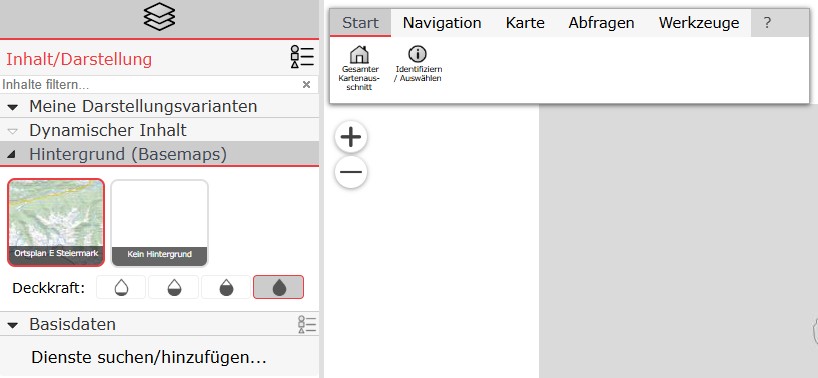
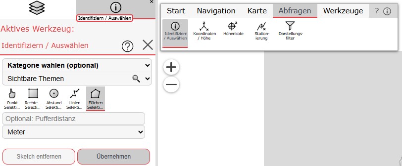
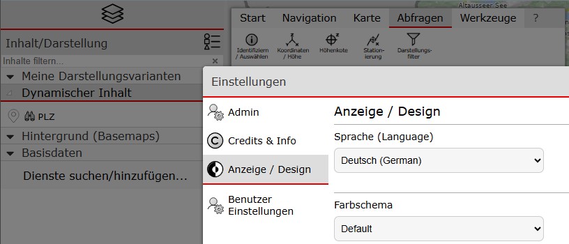
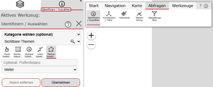
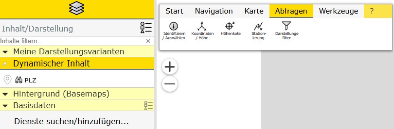
Each example includes two screenshots (TOC and tools) and a CSS snippet.
Modern: primary color plus header accent
Only the primary color is set; the light variant is calculated automatically.
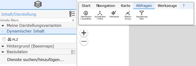
|
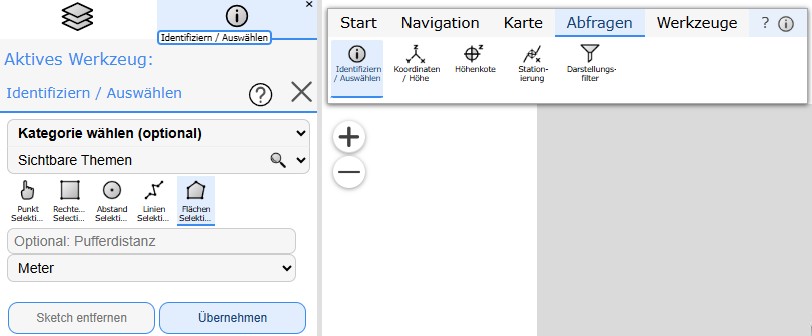
|
body, .webgis-container {
    --webgis-brand-primary:       #3b8cef;
}
Modern: only primary and light color
(STMK)
Here the light color is not calculated automatically but set explicitly.
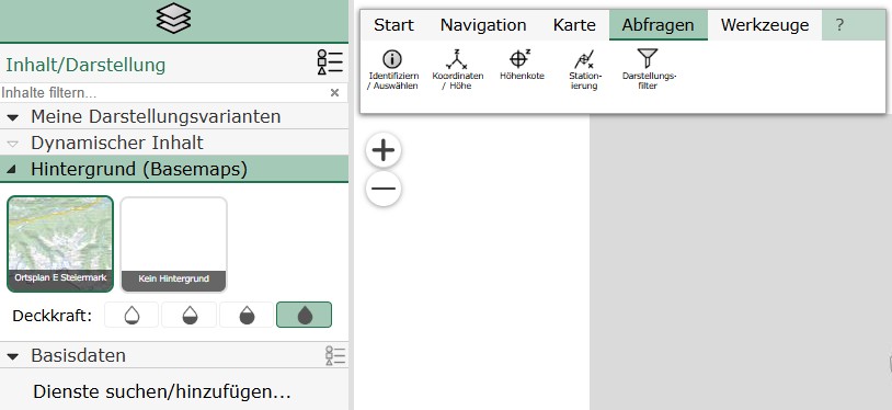
|
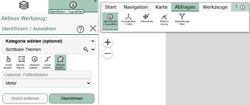
|
body, .webgis-container {
    --webgis-brand-primary:       #1f744f;
    --webgis-brand-primary-light: #a5c9b7;

    /* Text */
    --webgis-ui-text-selected: #000;

    /* Border */
    --webgis-ui-border-width-item-selected: 2px;
}
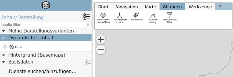
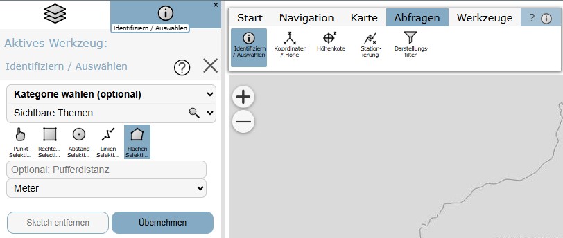
Flat: no underline for selected items
(BGL)
Primary and light color are set to the same value. This creates a reduced, flat look.
|
|
body, .webgis-container {
    --webgis-brand-primary:       #85abc4;
    --webgis-brand-primary-light: var(--webgis-brand-primary);

    /* Text */
    --webgis-ui-text-selected: #000;

    /* Border */
    --webgis-ui-border-width-item-selected: 0px;
}
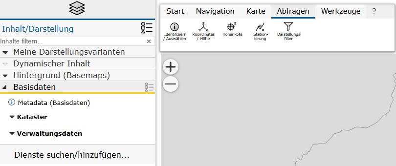
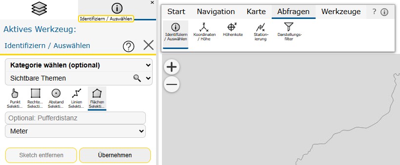
Two primary colors
(NÖ)
The light variant is set explicitly instead of being calculated automatically. This gives more control over readability and contrast.
|
|
body, .webgis-container {
    --webgis-brand-primary:       #ffd500;
	--webgis-brand-primary2:      #005a9a;
    --webgis-brand-primary-light: #eee;

    /* Text */
    --webgis-ui-text-selected: #000;
    --webgis-ui-text-header: var(--webgis-brand-primary2);

    /* Border */
    --webgis-ui-border-width-item-selected: 3px;
}

.webgis-tabs-tab-selected,
.webgis-ui-option-selected,
.webgis-toolbar-tabs .webgis-toolbar-tab.selected,
.webgis-toolbox-tool-item.selected {
    border-color: var(--webgis-brand-primary2);
}

.webgis-modal-title,
.webgis-modal-title,
.webgis-dockpanel-title,
.webgis-dockpanel-title {
   border-color: var(--webgis-brand-primary2);
}
Adjust the text color of selected items
(OÖ)
In addition to the brand colors, --webgis-ui-text-selected is adjusted here to improve readability on light surfaces.
|
|
body, .webgis-container {
    --webgis-brand-primary:       #ef3b42;
    --webgis-brand-primary-light: #ccc;

    /* Text */
    --webgis-ui-text-selected: #414753;
    /* Header (optional) */
    /* --webgis-ui-text-header: #414753; */

    /* Border */
    --webgis-ui-border-width-item-selected: 2px;
}
Adjust dialog headers
(VBG)
In addition to the brand color, dialog and panel headers are styled specifically through
--webgis-ui-surface-header and --webgis-ui-text-header.
|
|
body, .webgis-container {
    --webgis-brand-primary:       #e60000;
    --webgis-brand-primary-light: #ddd/*#aaa*/;

    /* Text */
    --webgis-ui-text-selected: #000;

    /* Border */
    --webgis-ui-border-width-item-selected: 2px;

	/* optional: headers of dialogs */
	--webgis-ui-surface-header: var(--webgis-brand-primary-light);
    --webgis-ui-text-header: #333;
}
Highlight presentation containers
(KTN)
This example extends the default variables with targeted styling for unselected presentation containers (.webgis-presentation_toc-title).
Note
No *_tools.jpg is currently available for this example. That is optional.
body, .webgis-container {
    --webgis-brand-primary:       #6a7981;
    --webgis-brand-primary-light: #ffdc00;

    /* Text */
    --webgis-ui-text-selected: #000;

    /* Border */
    --webgis-ui-border-width-item-selected: 2px;
}

/* optional: different color for unselected presention containers */
.webgis-presentation_toc-title {
    background-color: #ffffb3;
}